Changing the way you look at fellow flyers
Aero Glass will be changing the way you look at fellow flyers. Well, at least in the Aero Glass app. Here is how.
Some of you might already know that we are planning to release a new beta in Q1 2016, which means that improved software performance is coming your way – accompanied by a more polished user experience. On our trek to the latter, we’ve joined arms with the world’s largest, fully accredited university specializing in aviation and aerospace, the Embry Riddle Aeronautical University in Florida, whose experts are helping us refine the visualisation of the objects appearing in your view when using Aero Glass.
We are excited to report that we have already completed a few changes to Aero Glass’ symbology, more precisely the visualisation of other aircraft and their parameters. Here is sneak peek of what to expect.
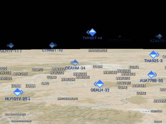
The improved symbology shows other aircraft’s:
- direction of flight from your vantage point – signalled by an arrow on either corner of their rectangle
- altitude relative to yours – marked in white inside the rectangle
- proximity – the more distant they are, the smaller and fainter their rectangle
For instance, in the next picture, the aircraft is:
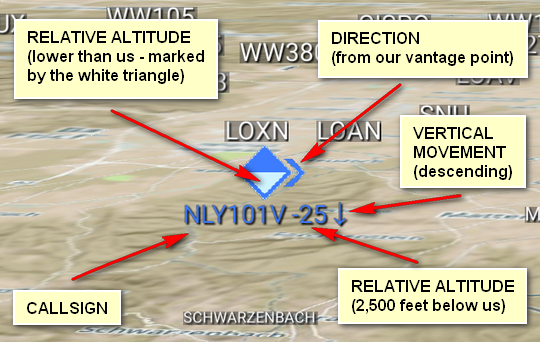
- flying with the callsign NLY101V – displayed underneath the icon
- at a lower altitude than we are – see the downward pointing white triangle inside the icon
- 2500 feet lower than us – see the number (-25) displayed after the call sign
- descending – signalled by the downward pointing arrow after -25
- moving on to the right from our vantage point – arrow on the right corner of the icon
The symbol’s size change based on proximity has done wonders to the clarity of the whole picture, especially with the added feature of displaying only the closest aircraft wherever there are two or more aircraft in the same line of sight. In practice, this means that the mark of any aircraft passing “behind” another will disappear from view and only reappear when the two are no longer in alignment.
Although there is still time until you can evaluate the changes in action, we are curious about your first impressions. What do you think? Is there anything else you think should be added to this segment of visualisation?